The Value Stream Map (VSM) is one of the most common “Lean tools” mentioned by books and consultants, including at MTG. But learning how to draw or read a VSM takes time and effort.
In this post, we'll show you how it's done.
A VSM makes the flow of information and materials visible. Its purpose is to show where some of the waste lies in the system and to plan for changes that will improve the whole system (not only one specific process). In short, it helps get close to the just-in-time (JIT). It is too easy to get bogged down in the specific conventions of value stream mapping symbols (which are not always intuitive and, for some of them, take a long time to draw).
We developed a step-by-step approach to drawing a basic VSM that focuses on essential information.
The most important aspect of a VSM is the visualization of the steps in a process. If you are new to value stream mapping, do not try to draw your first full map while getting familiar with a process. Pick one product and follow the materials physically from arrival in your facility to departure to customers (which might be another facility within your group).
Here are a few examples of steps to show on the flow chart:
You want to visualize the steps of a process, ideally through the whole supply chain. You might want your VSM to focus on what happens within your walls, but it is always good to show what happens in the end-to-end supply chain on a more macro scale.
For those who have read Lean Thinking, you will remember the example of Tesco, the British supermarket chain, studying all the steps necessary to make an aluminum can of soda from the Australian mine to the smelting factory in Scandinavia until the supermarket aisles in the UK. Getting a bird’s eye view of what happens in the entire supply chain is an excellent first step before delving deep into a VSM.
Need help mapping your value stream?
Manufacturing Transformation Group helps manufacturers identify waste and build leaner operations — from the shop floor to the supply chain. Book a free consultation to discuss your operation.
Show a box for each process step.
Most likely, you will need to go back to observe each process step and evaluate the following metrics:
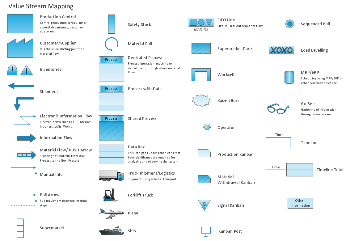
One downside of VSM conventions is the number of symbols to learn. A best practice is to put a VSM on the wall and share it with everybody, but the special symbols make it hard for people to understand what is communicated. Be prepared to give explanations.
Here is a great overview of the most common VSM symbols:
Source: http://www.conceptdraw.com/How-To-Guide/picture/VSM-symbols.png
This article won't explain the concepts of a supermarket, pull vs. push, central production planning vs. Kanban vs. linked and flowing processes, etc. We also don't go into the differences between a VSM of production processes and one of office work (and how to make them coexist on the same map). Instead, we will point to two good books on the subject.
These two workbooks go deep into a few value stream mapping examples.
So far, we expect you to have mapped the process steps in pencil on a large piece of paper while observing processes and “following” a product. Do you need to show that VSM in an excellent report, in a soft copy? There are now quite a few professional solutions, and here are three popular ones.
Quality Companion (by Minitab), a serious competitor to Visio for manufacturing-related diagrams
Add extra information if you have space on your map and think it is desirable. One example is human movement (in case some operators have to walk from one process to the next). Most mentors would be thrilled to see their mentee appropriate a tool to the point where they become creative and add to it!
Was this useful? Have you got other tips to share? We hope you can leave a comment about your experiences with value stream mapping below for our community.
Ready to eliminate waste in your operation?
We've used value stream mapping to transform factories across four continents. Let us help you see where your biggest opportunities are.